Don’t miss our next trade idea. Get on the Bear Traps Report Today, click here
Secular Silver Shift
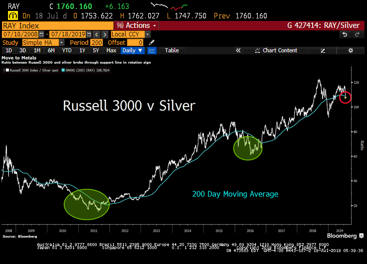 This week, the ratio between the Russell 3000 Index and silver fell below its 200-day moving average, a significant event. In our view, this is a clear sign investors are shifting into asset classes which benefit more substantially from global central bank rate cuts.
With conviction in May, we had clients establish meaningful gold and silver positions, to get on our distribution list, please email tatiana@thebeartrapsreport.com.
Since the Fed’s Dovish Shift in late May
GDX Gold Miners: +40%
SIL Silver Miners: +33%
EWZ Brazil: +25%
GLD Gold: +14%
SLV Silver: +14%
SPY S&P 500: +8%
EEM Emerging Markets +8%
IWM Russell: +6%
Ever since the Fed caved on rate cuts, precious metals and miners saw parabolic rallies. As the Federal Reserve caved on its hawkish policy path and the US Dollar began to weaken, metals have crushed US equities.
Ugly Budget Coming out of Washington
U.S. budget deficit increased by $140 billion during the first nine months of this budget year to $747.1 billion as government revenues and spending both hit records. The Treasury Department reported Thursday that the deficit for the current fiscal year through June is up 23.1% over the same period a year ago with receipts rising by 2.7% while spending increased 6.6%. The Trump administration is forecasting that the deficit for the full budget year, which ends on Sept. 30, will top $1 trillion, up from a deficit of $779 billion last year.
The Recent Surge
At the beginning of June this year, metals began shooting higher once again. Capital crowded in the US Dollar finally began to leave as the Fed guided towards an end-of-July cut. Similar to the beginning of 2016, gold and silver are not taking a breather, investors have had few chances to add on a ‘pullback’.
SLV Silver Trust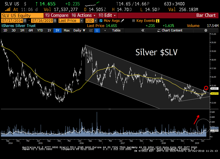 Silver is breaking out of an elongated downtrend to the upside. Precious metals remain one of the best risk/reward trades in the near-term, in our view. Similar to the beginning of 2016 when the Fed caved on their hawkish policy path, precious metals are not taking a breather in their rally higher. Regardless of the global growth trend, a weaker dollar is a major tailwind here. iShares Silver Trust SLV, the average daily volume in May was 6.3M shares and nearly 40M shares were traded on Tuesday. That’s some serious FOMO (fear of missing out) capital flow.
In our view, Sometime in the Next Few Years
1) central banks will run out of stimulant to boost the markets and the economy when the economy is weak.
2) there will be an enormous amount of debt and non-debt liabilities (e.g., pension and healthcare) that will increasingly coming due and won’t be able to be funded with assets.
In Ray Dalio’s view, (we agree) the paradigm that we are in will most likely end when;
a) real interest rate returns are pushed so low that investors holding the debt won’t want to hold it and will start to move to something they think is better.
b) simultaneously, the large need for money to fund liabilities will contribute to the “big squeeze.” At that point, there won’t be enough money to meet the needs for it, so there will have to be some combination of large deficits that are monetized, currency depreciations, and large tax increases, and these circumstances will likely increase the conflicts between the capitalist haves and the socialist have-nots. Most likely, during this time, holders of debt will receive very low or negative nominal and real returns in currencies that are weakening, which will de facto be a wealth tax.”
% of Euro Denominated Corporate Bonds Outstanding with Negative Yields
2019: 13%
2018: 1%*
2017: 2%
2016: 5%
2015: $0
2014: $0
2013: $0
2012: $0
2011: $0
2010: $0
2009: $0
2008: $0
BofA data, BBB investment-grade bonds, nearly 3% of junk bonds trade with a negative yield. Central banks are forcing capital into places it just shouldn’t be, moral hazard squared. Over the last 40 yrs, we’ve been lectured on the relationship between gold/silver and inflation, but it’s really about price stability. Markets have been pricing in deflationary risks for much of this year. Central banks lose control of prices = precious metals tailwinds. The explosive growth in negative-yielding corporate bonds points to global deflation risk on the rise, that’s FAR from stable prices, gold and silver are sending an important message.
*Dec 2018 data
Sovereign Defaults Piling Up last 10 Yrs
Greece
Jamaica
Belize
Puerto Rico
Iceland
Grenada
Barbados
Venezuela
Argentina
Ukraine
Ecuador
Turkey?
Mathematically unsustainable promises to voters. Populists on the left want to walk away from colossal debt obligations, on the right they want tax cuts.
Credit, Capitalists, and Socialists
At the same time, Ray Dalio points out there will be greater internal conflicts (mostly between socialists and capitalists) about how to divide the pie and greater external conflicts (mostly between countries about how to divide both the global economic pie and global influence). In such a world, storing one’s money in cash and bonds will no longer be safe.
Global Corporate Bonds at Negative Yields
2019: $623B
2018: $12B*
2017: $90B
2016: $226B
2015: $32B
2014: $0
2013: $0
2012: $0
2011: $0
2010: $0
2009: $0
2008: $0
Bloomberg, DB data
*Q4 December
Central banks are forcing capital into places it just shouldn’t be, moral hazard squared.
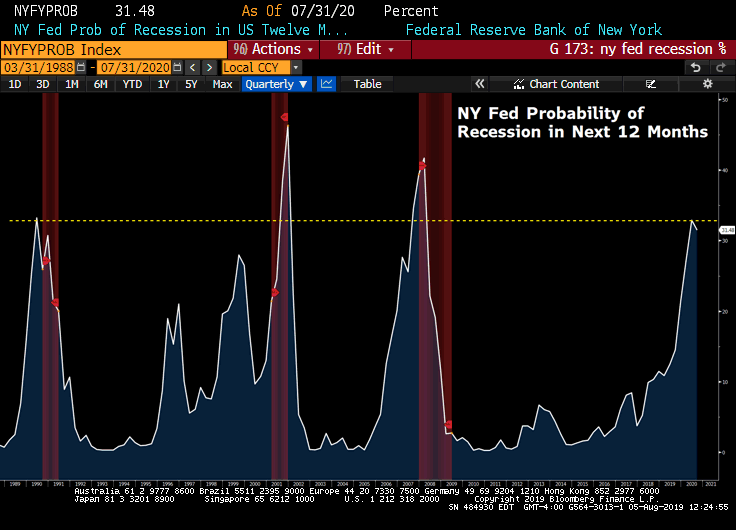
As the Fed Softens their Policy Path, HIGH Impact on Emerging Market Financial Conditions
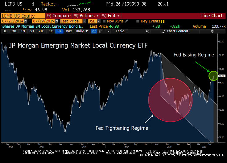 Rate cuts get vaporized in a swift economic downturn. The Fed is saying (this week’s John Williams speech), if they cut now – with force – while the US economy still has momentum, we’ll actually have a chance at creating inflation, and avoid deflation and the negative rate trap in Europe and Japan. The impact on global financial conditions, relative to Fed policy is on stage here (above). Emerging market local currency debt has caught a meaningful bid.
Investors Beware
“Bonds are a claim on money and governments are likely to continue printing money to pay their debts with devalued money. That’s the easiest and least controversial way to reduce the debt burdens and without raising taxes. My guess is that bonds will provide bad real and nominal returns for those who hold them, but not lead to significant price declines and higher interest rates because I think that it is most likely that central banks will buy more of them to hold interest rates down and keep prices up. In other words, I suspect that the new paradigm will be characterized by large debt monetizations that will be most similar to those that occurred in the 1940s war years. So, the big question worth pondering at this time is which investments will perform well in a reflationary environment? A world with large liabilities coming due and with significant internal conflict between capitalists and socialists, as well as external conflicts. Most people now believe the best “risky investments” will continue to be equity and equity-like investments, such as leveraged private equity, leveraged real estate, and venture capital, and this is especially true when central banks are reflating. As a result, the world is leveraged long, holding assets that have low real and nominal expected returns that are also providing historically low returns relative to cash returns (because of the enormous amount of money that has been pumped into the hands of investors by central banks and because of other economic forces that are making companies flush with cash). I think these are unlikely to be good real returning investments and that those that will most likely do best will be those that do well when the value of money is being depreciated and domestic and international conflicts are significant, such as gold. Additionally, for reasons I will explain in the near future, most investors are underweighted in such assets, meaning that if they just wanted to have a better-balanced portfolio to reduce risk, they would have more of this sort of asset. For this reason, I believe that it would be both risk-reducing and return-enhancing to consider adding gold to one’s portfolio. I will soon send out an explanation of why I believe that gold is an effective portfolio diversifier.”
Ray Dalio, July 2019
Gold to Silver
Although gold and silver rally in tandem, silver has historically outperformed when both are spiking (see 2016 results). Meanwhile, the ratio of gold to silver is just off 30 years highs! In our view, there is significant ground for silver to catch up here.
Gold to Silver Ratio 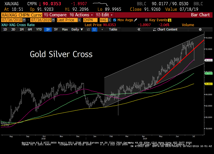 Metals continue to be strongly bid as gold and silver miners are rallying again this week despite a stronger US Dollar. Silver also significantly outperformed gold again. We highlighted this in our client chat recap yesterday, capital flows from gold to silver, are picking up steam. As we have stressed to clients throughout the last month, overweight silver here.
Bloomberg Nickel Subindex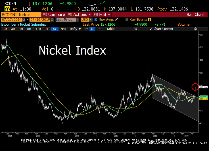 One reason why silver has begun to outperform gold so much is that it is following the price of Nickel. Futures in Nickel have broken out to a parabolic-like rally, up almost 20% since late June and up over 30% since December. Although the dovish Fed guidance has been a major contributor to the Nickel rally, the industry has also been supported by supply-side reductions in recent weeks. The earthquake that hit Indonesia, as well as continued production cuts from Brazil’s Vale, have added to the upside price pressure.
Don’t miss our next trade idea. Get on the Bear Traps Report Today, click here


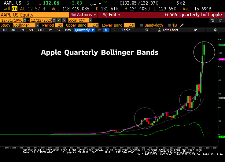
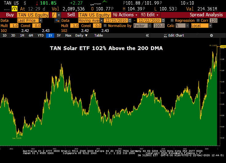 The TAN Solar ETF is now 102% above the 200 day moving average, the largest spread in the ETF’s history.

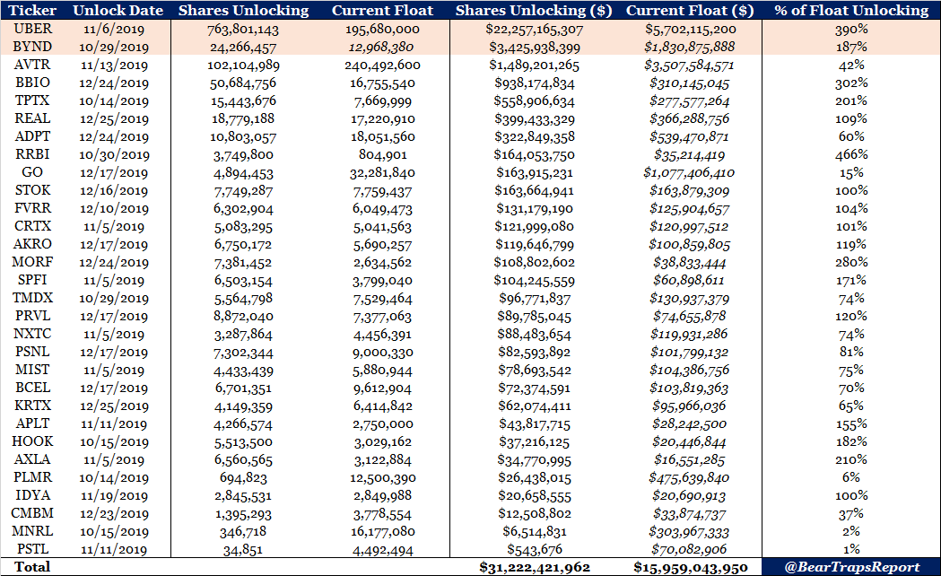
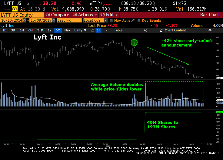
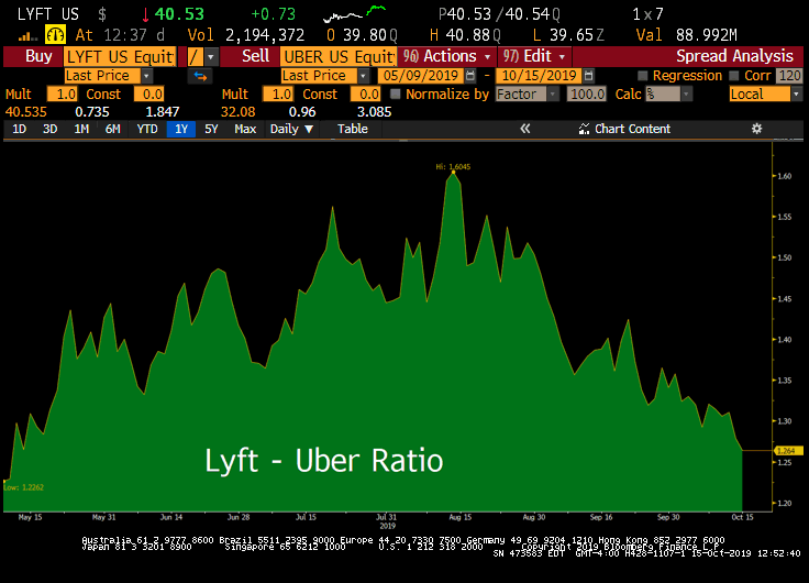 Ridesharing companies LYFT, and UBER don’t have a moat in our view. It’s like “Chinese capitalism” (that funnels lots of profits to consumers, thus poor performance in the company’s stock prices). It’s a subsidy of consumers (Uber riders) at the expense of Uber shareholders and Uber Drivers.
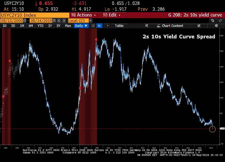 The 2s 10s US yield curve spread inverted for the first time since mid-2007 on Tuesday. Despite many other areas of the curve having inverted earlier this year (3-month / 10-year for example), the widely followed 2s / 10s curve had the media’s attention throughout the day and helped contribute to the significant equity sell-off. When coupled with slowing global growth and rising geopolitical tensions, markets ran-away in fear, from this classic recession indicator.
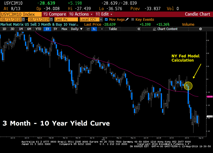
 Before stocks began to sell-off last week, the ratio of S&P 500 growth vs. value nearly touched its all-time high set during the dot-com bubble. We are confident this structural market shift will continue and are bullish on the value (defensive stocks, consumer staples) vs. growth rotation.
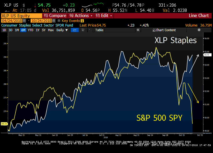 A significant divergence began between the S&P 500 and staple equities this week. Capital has to flow somewhere.
